Hi, I'm Eli, Independent designer
Pages that sell your course, community or offer, all the way to checkout.
Websites and sales pages, plus the automations and social content behind them.
Sound familiar?
I know this because I run my own business in Bulgaria.
I've been on both sides - the one needing the design,
and the one building it.
That's exactly why I started Ellable.
Webinar funnel, sales page and checkout
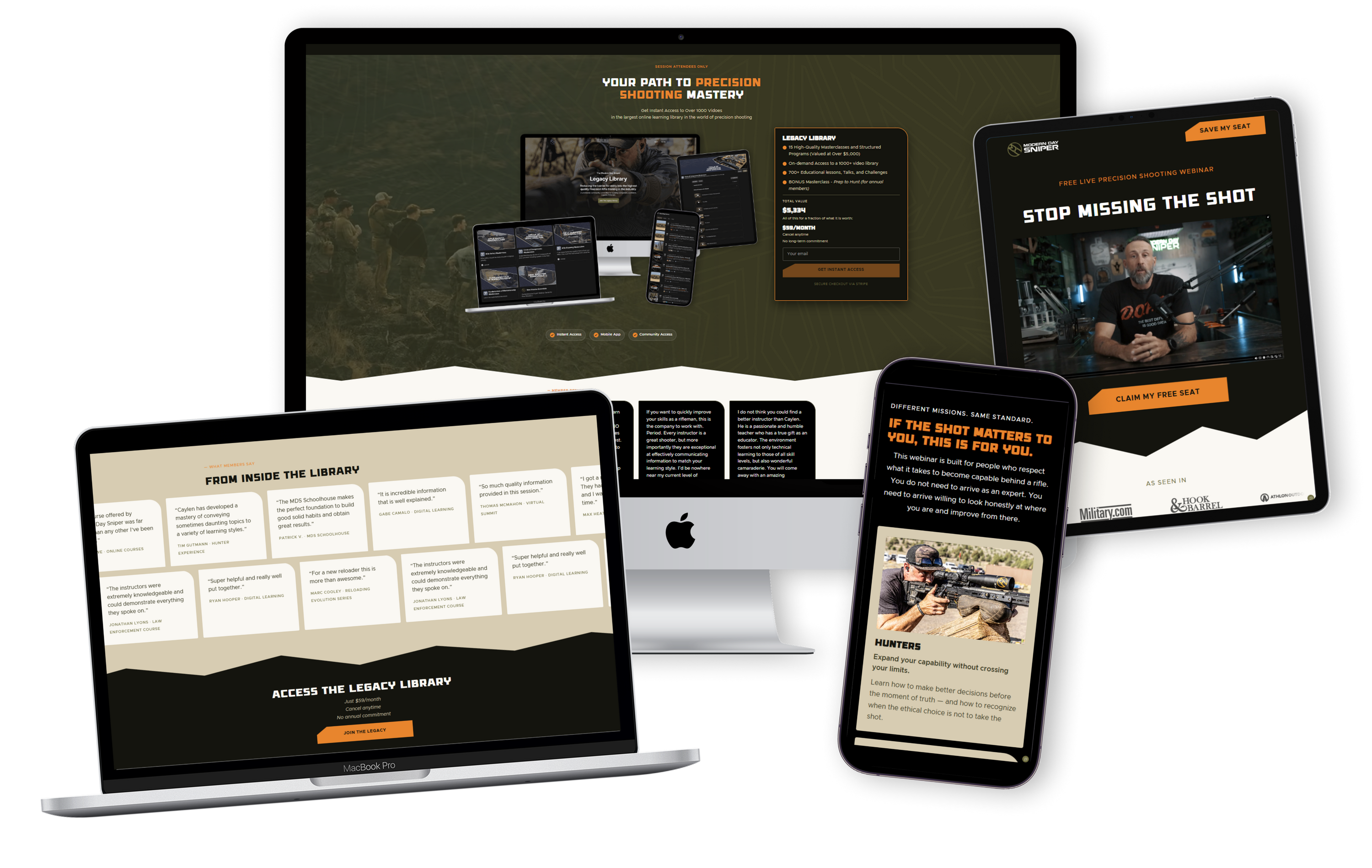
Pages, checkout and launch visuals for a US online training school, built around a live webinar.
The challenge
A US precision-shooting school selling an online training library live during a webinar. They needed a full funnel by a fixed date, with a webinar-only offer that turns into the regular plan on its own.
Results
- 100 of 100 webinar seats taken.
- $5K in sales during the webinar.
- Zero manual work when the offer ended.
Sign-up page
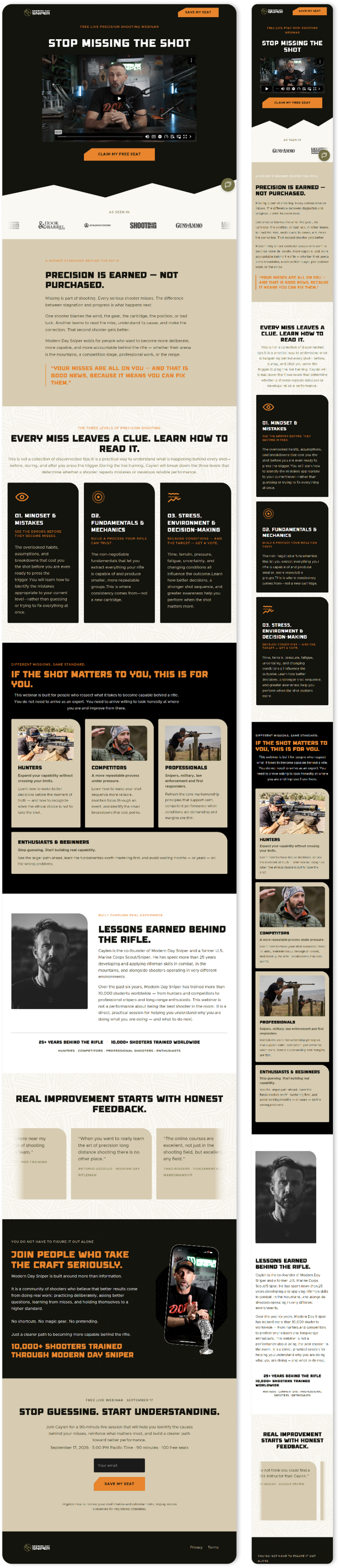
A VSL funnel built to fill the webinar: a short video, one promise, one button.
Sales page
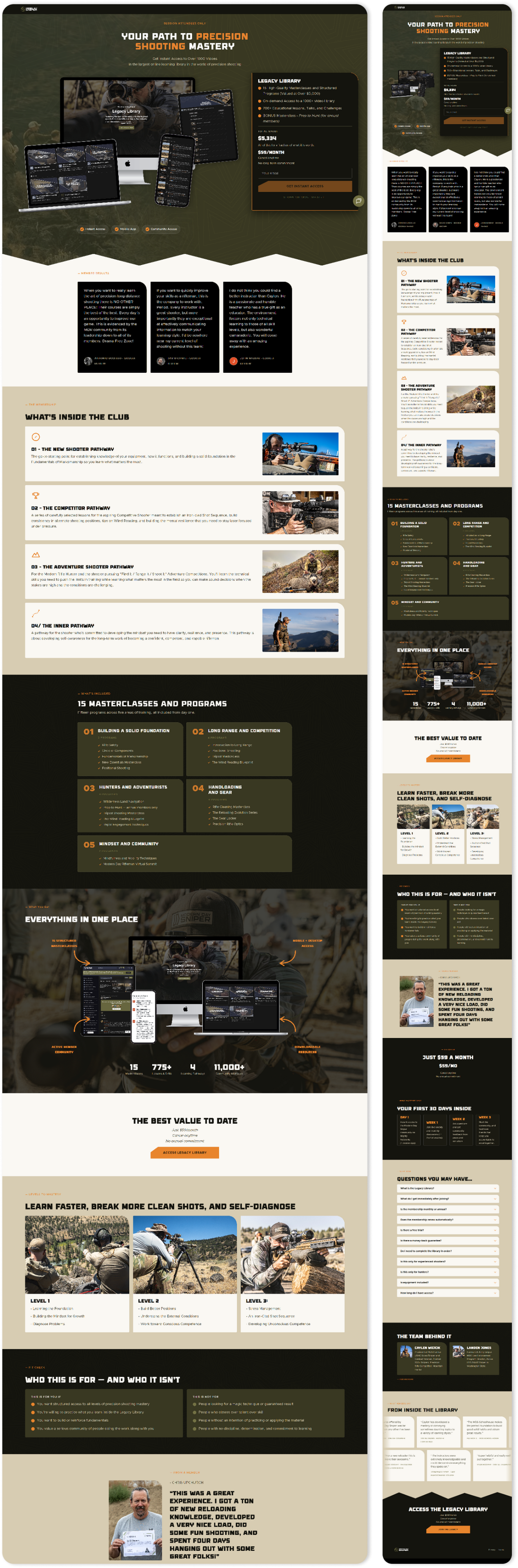
A long-form sales page with everything in one place: what’s inside, who it’s for, member reviews, pricing, FAQ and checkout.
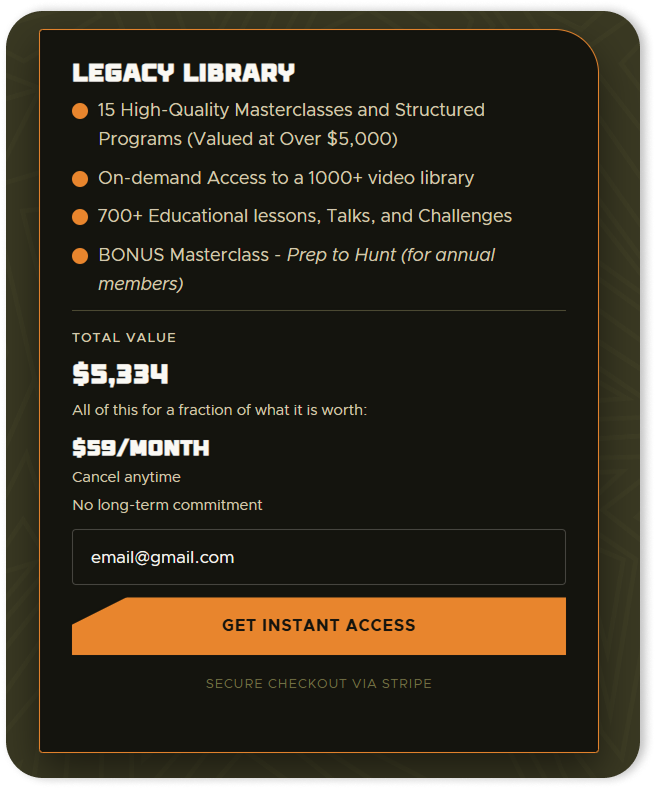
Checkout and pricing
Checkout built into the page, connecting Stripe, Xano and Webflow. The webinar offer runs on a Stripe promo code with a timer. When it expires, the price changes automatically and the checkout on the site switches with it.
Events page
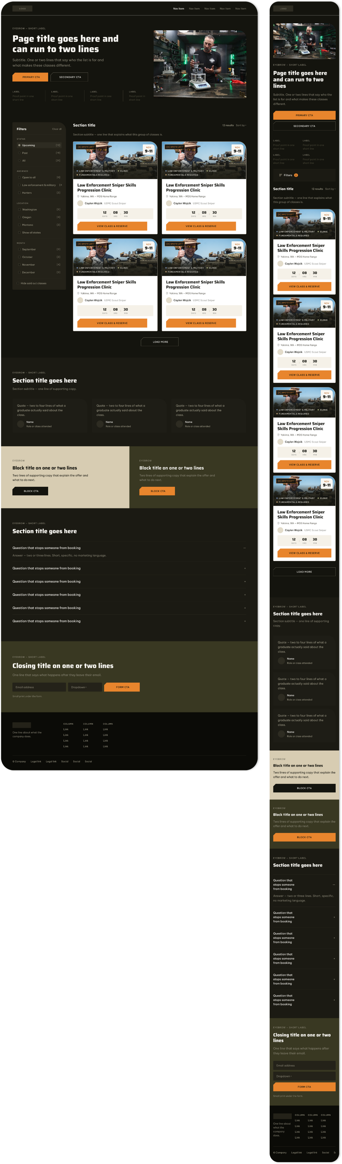
An events page for the main site with upcoming and past classes, filters by course and audience, on desktop and mobile.
Launch campaign
Carousels and email banners in the same style as the pages, each ending with one call to action: comment “webinar” to get the free training.

What the client said
The founders, after the launch:
“We want to thank you from the bottom of our hearts for your design work. It is some of the best work we have seen in some time.”
Hygge for Two
Brand and website for a personalized board game.

Overview
Hygge for Two is my own brand of personalized board games for couples. Each game is built around one couple’s story, so every order is different. I designed the brand, the game and the website that sells it.
The problem
Personalizing a physical product is complicated. Names, dates, photos and stories all have to come from the customer, and done badly, ordering feels like filling out a long form. People give up halfway.
The approach
- Story first, catalog second. The homepage opens with the idea behind the game, not a product grid.
- Ordering in 4 small steps. Each step asks for one thing, with visuals instead of long form fields.
- Built for phones. Uploading photos and details is easy on any screen.
- Warmth in the details. Soft colors, rounded type and custom icons carry the cozy feel of the game.

Design system
- Typography: a playful serif for headings, with a clean sans-serif for body text.
- Palette: Twilight Lilac as the main color, Sunset Yellow saved for calls to action.
Outcome
Orders doubled after the redesign, and now come in even without paid ads.
Fitness Studio Website Redesign
A function-first website for a small fitness studio, built to turn visitors into booked sessions.

Overview
The studio needed a complete website overhaul on a tight budget, with a clear priority: function over decoration. No trends and no heavy visuals, just a clean, accessible site that turns visitors into booked sessions.
The problem
Choosing a studio is a comparison. People want to know which program fits them, who will train them, when there’s a free spot and what it costs. If any of that is hard to find, they leave to check the next studio.
The approach
Every section follows the order in which a potential member actually makes a decision.
- A clear promise up front. The hero says what the studio offers and who it’s for, with one obvious next step.
- Programs side by side, so visitors can compare and pick without reading every page.
- Real people. Trainer profiles put faces to the sessions, which matters when someone is deciding who to train with.
- A live schedule with availability, so free spots are visible before anyone clicks “book”.
- Pricing that answers questions. A simple table shows what each plan includes, so cost is never the reason someone leaves.

Built for a small budget
The goal was a professional online presence for a small fitness business, without the enterprise price tag: a simple structure that puts the effort where it pays off, in the booking path.
Zemya Voyages
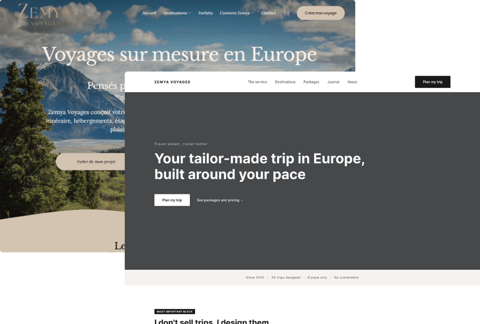
UX audit and homepage redesign for a new kind of travel service.
Overview
Zemya Voyages is a slow-travel design service for the French market. The founder designs one custom itinerary per client and takes no commission. It’s a genuinely new category of service, and that turned out to be the heart of the problem.
The problem
Engagement kept dropping. After several visits I still couldn’t explain what you get, what it costs, or why to choose it. If a designer can’t parse it, a tired parent comparing options late at night won’t either.
The audit
Scores out of 10: positioning 8, information architecture 7, visual design 6, conversion 5, mobile UX 5.
- The hero button led to the About page instead of an action.
- Pricing was buried two levels deep.
- The how-it-works steps appeared twice on the same page.
The approach
- Name the category: “I don’t sell trips. I design them.”
- Show the value with a quick with / without Zemya contrast.
- Surface the pricing right on the homepage.
- One path to convert: a single “Plan my trip” action from top to bottom.

Outcome
The founder agreed with the audit, and the redesign is approved and in implementation. After launch we’ll track bounce rate, how many visitors reach pricing, and form starts.
Social, campaigns & print
Visuals for brands that need to show up everywhere: social feeds, ad networks, in-store screens and print.

Workshop campaigns
Online workshops for a tech education platform. Each workshop gets its own look, then a full set built from it: carousels, stories and ad banners in every size the ad networks ask for.


One brand, every format
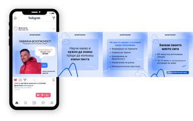
A sports education brand where the same clouds, mountain line and blues carry across the cover, a carousel and a full set of ad banners.


Healthcare and pharma
Social content for a pharma company and a hospital: clear, calm and easy to read in a busy feed.

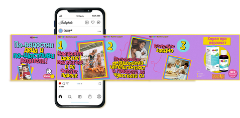
Single posts
One-off posts for brands in very different worlds: cars, real estate and sports nutrition. Each one had to stop the scroll in a single frame.
Retail promotions
Seasonal offers for a tools retailer, sized for both social feeds and in-store video walls.
Print catalogs
Catalog spreads for a building materials retailer, mixing product listings with how-to content so the pages are worth keeping.
This is what happened when we worked together
Hi, I'm Eli.
When I started my own brand, a personalised board game, I had to build everything myself. The brand, the website, the checkout, the orders. No time for any of it.
So I learned what makes a page work and what makes someone actually click 'buy'. And I automated the rest.
Now I design those pages for other online businesses.
You probably have questions.
I surely have answers.
Let's figure out what you actually need.
No pitch. No pressure. Just a real conversation.
Елица Стоянова
Правя реклами, сайтове и визия за малки и средни бизнеси - както за фирми с история, така и за такива, които сега започват.
От София съм, работя с фирми в цялата страна.
6+ години дизайн, 20+ завършени проекта.